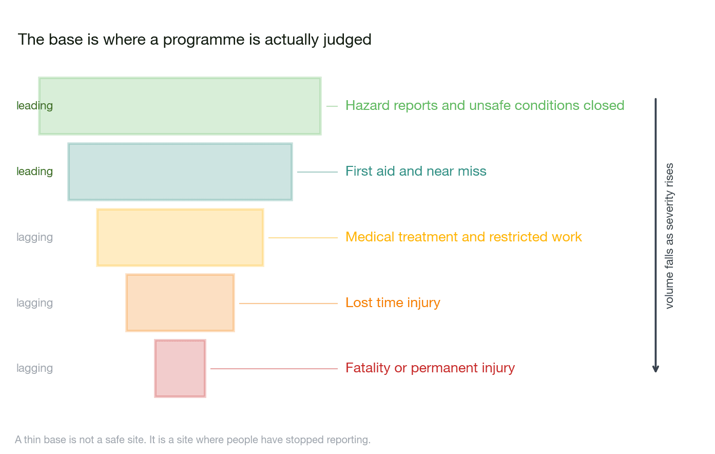
A falling injury rate means nothing if hazard reporting fell with it.
We read the source systems directly and keep the tiers separate rather than blending them into one score. A hand assembled monthly pack describes the position as it stood when the assembly started, and it is the base of the triangle, the hazard reports and near misses, that a blended score conceals.


Read from the base upward
Hazard reports and unsafe conditions closed
leadingVolume and closure rate by site, with the age of the oldest open item
First aid and near miss
leadingReporting rate per exposure hour, tracked against the injury rate above it
Medical treatment and restricted work
laggingRecordable rate on a definition agreed once and held
Lost time injury
laggingFrequency and severity, with days lost separated from case count
Fatality or permanent injury
laggingRecorded in full, never blended into a composite score
Definitions before charts
Two sites will count a recordable differently, or measure training currency against different matrices, and any comparison drawn across them is then arithmetic on unlike quantities. We settle the definitions first, write them down and hold them, so a rate that moves reflects the plant rather than the rule.
What the first quarter will look like
This dashboard will make some sites look worse in its first quarter. Those are usually the sites that were reporting honestly all along.
Stand up your EHS indicator set
We will come back with the definitions we would fix first, the tier structure and what it would take. Tell us which systems hold your hazard reports, injury records and work hours.