
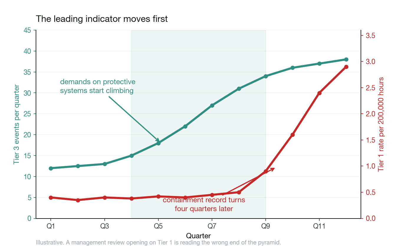
By the time a Tier 1 rate turns, the event behind it has already happened.
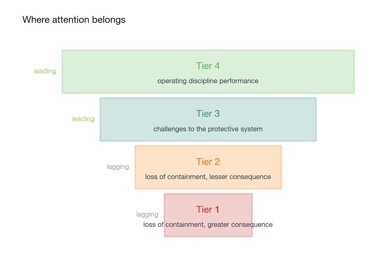
We build reporting that reads the systems already holding your data, normalises to the API RP 754 basis and puts the leading tiers in front of a management review. An indicator earns its place by being current and by pointing forward, and one assembled by hand each month is neither.
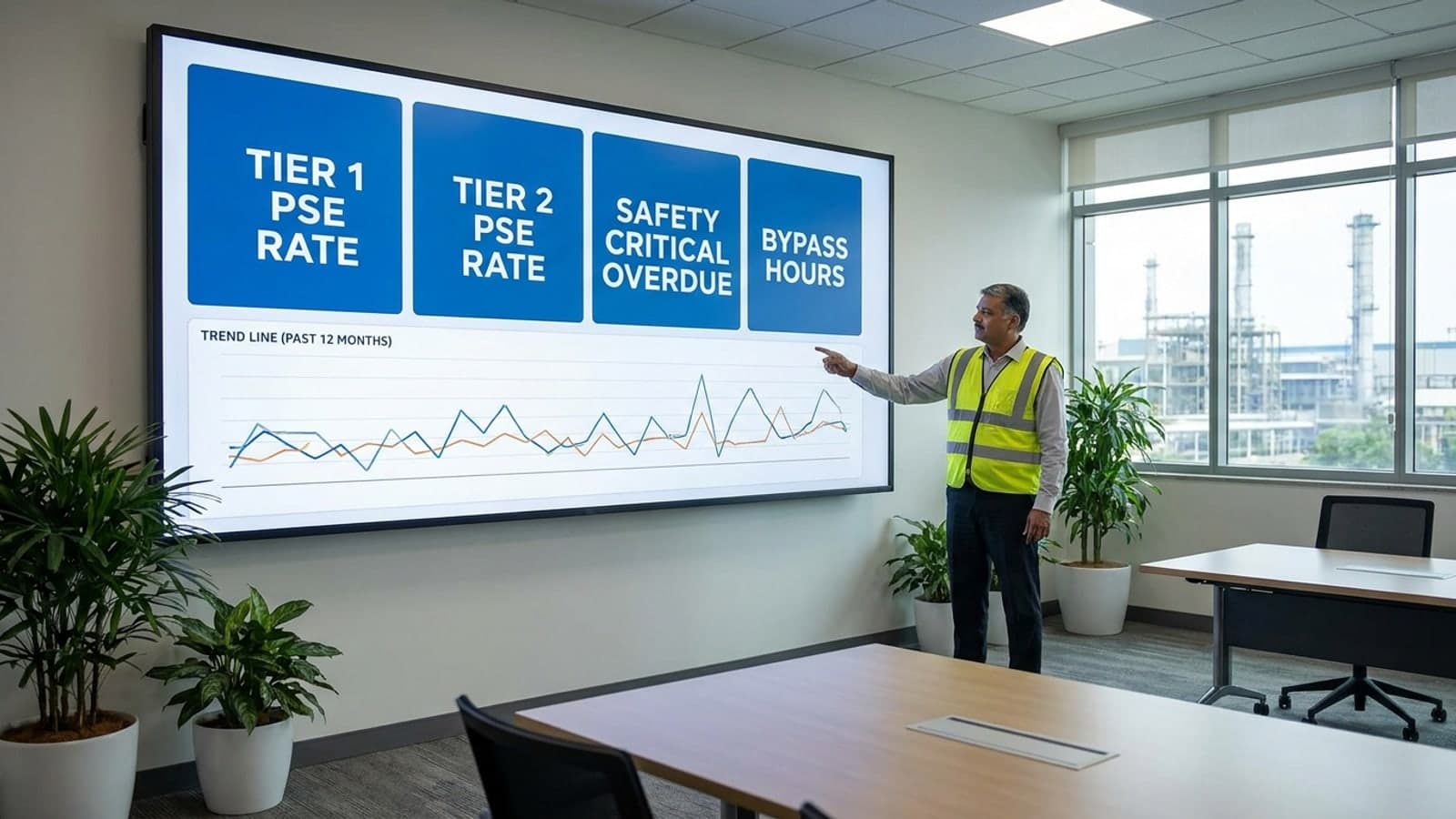
Every number comes from a system you already run
Nothing here asks anyone to key a figure in a second time. If it cannot be read from a source system, it does not go on the dashboard.
- Incident and loss of containment records
- Tier 1 and Tier 2 counts, classified at the point of record
- Safety instrumented function demand and bypass logs
- Tier 3 demands, and how long protection sat bypassed
- Relief device activation and safe operating limit excursions
- Tier 3 challenges the plant absorbed without an event
- Inspection, proof test and action registers
- Tier 4 discipline, including what is overdue
- Payroll and contractor management
- Work hours, so a rate means the same thing across sites

A small site swings hard
A site with a narrow exposure base sees a single event move its rate a long way. We show that swing alongside the rate, because a trend read from three events is noise presented as signal, and a board deserves to know which one it is looking at.
What a dashboard cannot do
A dashboard reports. It does not investigate, and it cannot tell you why a number moved. What it can do is put the question in front of the right people while there is still time to answer it.
Stand up your process safety indicator set
We will come back with the tier mapping to API RP 754, the refresh design and a delivery timeline. Tell us which systems hold your incident, bypass, relief and proof test records.