KPI Dashboards and Performance Visualisation
We design persona driven KPI architecture with layered dashboards that run from the operator HMI all the way up to the executive scorecard
KPI Dashboards and Performance
Visualisation
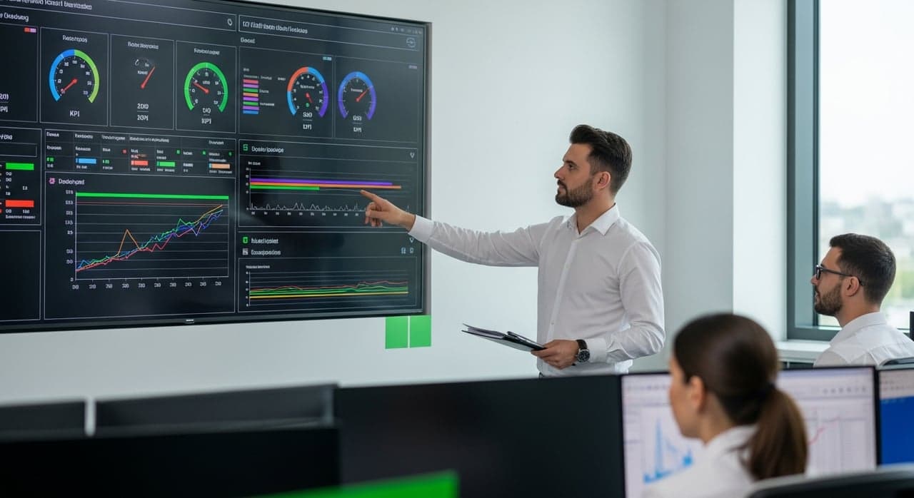
Our team builds the dashboard system that carries a signal from the operating floor through to the boardroom. We create the operator HMI, the supervisor production board, the manager dashboard and the executive scorecard, and we tune each layer to the decisions that person actually needs to make. We apply the visual design thinking of Stephen Few and Edward Tufte so that every screen reads clearly and reduces the mental effort needed to spot what matters.
Our implementation model
We fix the standards that apply to your site before we open at user & persona definition, and we do not close at adoption & governance until they are met.
Define dashboard users, operator, supervisor, manager, executive, identify decision needs per persona.
Select KPIs per persona, operational (real time), tactical (daily/weekly), strategic (monthly/quarterly), build hierarchy.
Integrate data sources (ERP / MES / EAM / DCS / external) into unified data platform, ensure data quality and refresh.
Apply Stephen Few / Edward Tufte design principles, bullet charts, sparklines, heat maps, traffic light status.
Deploy mobile optimised dashboards, self service report builder, alerts and notifications via Power BI / Tableau / Qlik.
User training, embedded in review cadence, KPI refresh process, data governance and access control.
KPI Dashboards and Performance in full scope

Value of KPI Dashboards and Performance Visualisation
- Your team sees KPIs in real time
- Early warning signals surface before they escalate
- Operators stay engaged through clear visualisation
- Lessons travel cleanly from one shift to the next
- We align KPIs to the ISO 22400 manufacturing standard
- We follow the ANSI ISA 101 HMI standard
- Every KPI definition is documented so your team can defend it under scrutiny
- We protect data integrity in line with Sarbanes Oxley expectations
- Decisions get made faster
- Variance gets attention earlier
- Accountability for performance becomes clear
- Every level of the organisation works from the same numbers
- Earlier intervention lowers your operating cost
- You avoid the cost of late corrective action
- Resources get allocated where they earn the most
- Performance incentives line up with the right measures
Codes & standards we work to
Triggers that signal the need
Where KPI Dashboards and Performance Visualisation applies
Tangible deliverables
- A persona need analysis
- A KPI architecture document
- A data integration design
- Dashboard mockups and the final design
- A mobile and self service platform
- An adoption training pack
Send us the scope
We will scope KPI Dashboards and Performance Visualisation against your site and come back with what it would take. Tell us where the process is losing time, yield or margin.